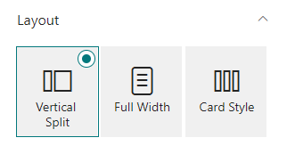
Layout
Choose one of the 3 available layouts
Configure layout
Here you can configure the layout, by mapping fields for each of the available positions. Configure layouts is only available to lists that aren't created trough carousel and dynamic content. Native lists use the Add/Edit panel to change values.

Specific options
Each layout has 2 specific options.
Vertical Split
One of the 2 options is the ability to position the caption on the left or right side. And the other being the ability to resize the caption between 3 sizes: - 33% - 40% - 50%

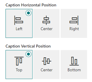
Full Width
Both of the options involve positioning the caption, either being horizontally or vertically.
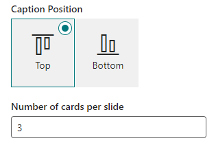
Card Style
One of the 2 options is to position the caption, either on the top or in the bottom. The other option is to specificy the amount of cards there is per slide. It's important to note that the carousel adjusts it's size depending on available space, so the web part might not show the number of cards specified if it doesn't have enough space!
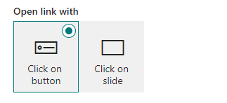
Open link with
This option is to specify wether the link associated to the slide is open through a button or clicking on the slide.
Colors
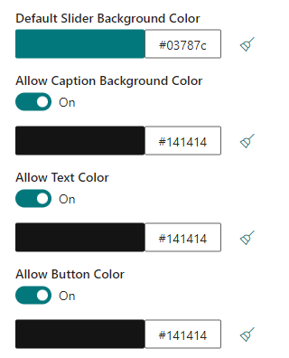
Default Carousel Background Color
In the case of not having an image or video as a background, the slide can also have a color, this option is to specificy the default color the slide will have in this scenario. (Note this option does not override the color specified on the Add/Edit panel)
Caption Background Color
This is a toggable option and allows the user to change the background color of the caption.
Text Color
This is a toggable option and allows the user to change the color of the text.
Button Color
This is a toggable option and allows the user to change the color of the button.
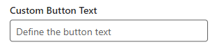
Custom Button Text
This option allows to change the text on the button. This is only available when the data source is dynamic contents, in the other data sources the text of the button can be changed through the Add/Edit panel.
Text
The text can be positioned differently inside the available space of the caption box. Through the Text Position and Text Alignment options, the user can change the position vertically and horizontally, respectively.

Background Fit
This option allows the user to specificy the position of the background image.
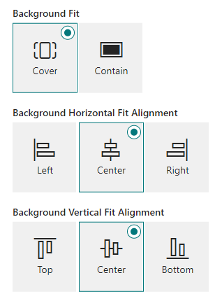
Cover
If the user selects cover (the default option), there's two additional options. The user can than position the background depending on the part of the image that is cut. The first option positions it horizontally, while the second positions it vertically. (Note these options move the image around depending on the space that is cut, what this means is that the image is initially placed to respect one of the sides, so if the image is placed to respect the height of it, the vertical alignment option won't change anything, only the horizontal alignment, and the opposite happens if the width of the image is respected)
Contain
If the user selects the contain option, the image will be displayed in full, adding bars to the remaining space. (Note: By changing the default background color, you can change the color of these bars)
Carousel Indicators
This option allows the user to change the look of the carousel indicators, the default look are empty squares, but by selecting the 'Rounded' and/or 'Number Labels' option, you can change the styling of it.


Carousel Arrows
This option allows the user to disable the arrows.
Carousel Interval
This option allows the user to change the interval the carousel takes to change between slides automatically. (Leaving the field empty or typing 0 is interpreted as disabling the interval, thus making the carousel stop moving automatically)
Carousel Height
This is a toggable option and allows the user to give a custom height to carousel measured in pixels, between a range of 100 to 1000. (The default height is 530 pixels)
Max Slides Shown
This option allows the user to limit the number of slides that is shown. (By default, there's no limit. Leaving the field empty or typing 0 is interpreted as allowing all slides to be shown)